
Heaven’s Windows
Revamping the website to enhance the nonprofit’s reach, fostering greater donor and volunteer involvement
Type Nonprofit Website Redesign
Timeline July 2023 - Sep 2023
Role UI/UX Designer
Team 6 Designers, 1 Web Developer,
1 Design Mentor
CLIENT & PROJECT OVERVIEW
About Heaven’s Windows
Heaven’s Windows is a non-profit organization based in San Diego, dedicated to assisting adults, families, and children that are struggling with food insecurity. They hope to uplift poverty-stricken communities, provide opportunities to contribute, and promote connections amongst each other in the process.
Heaven’s Windows is a non-profit organization based in San Diego, dedicated to assisting adults, families, and children that are struggling with food insecurity. They hope to uplift poverty-stricken communities, provide opportunities to contribute, and promote connections amongst each other in the process.
Heaven’s Windows is a non-profit organization based in San Diego, dedicated to assisting adults, families, and children that are struggling with food insecurity. They hope to uplift poverty-stricken communities, provide opportunities to contribute, and promote connections amongst each other in the process.
Heaven’s Windows is a non-profit organization based in San Diego, dedicated to assisting adults, families, and children that are struggling with food insecurity. They hope to uplift poverty-stricken communities, provide opportunities to contribute, and promote connections amongst each other in the process.
OBJECTIVES
Boosting exposure, engagement, and program awareness
Create a welcoming and user-friendly website that will give Heaven’s Windows more exposure, communicate their mission, and be more informative to users who need its resources
Appeal to different members of the community, including volunteers, staff, partners, and donors
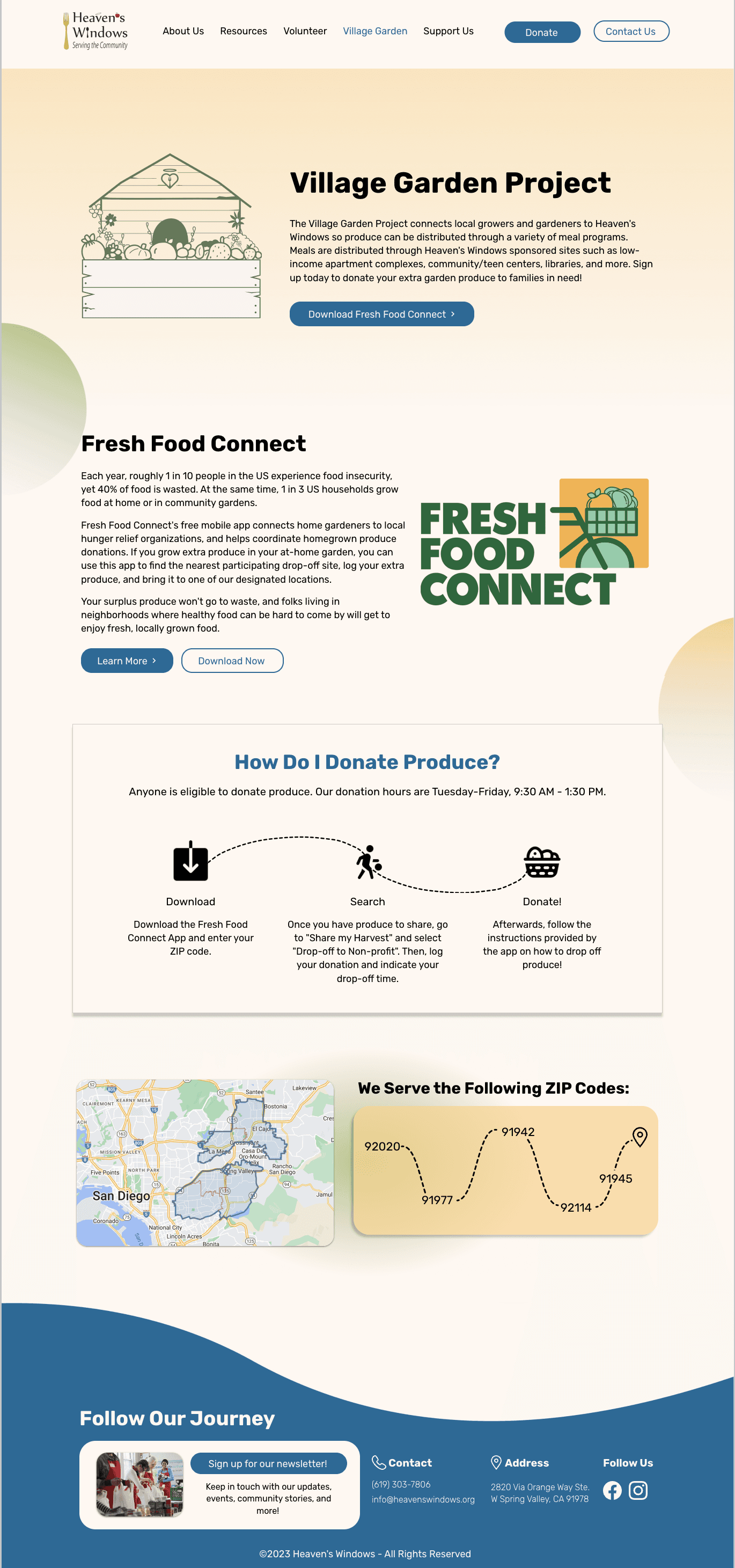
Introduce Heaven’s Windows’ newest program, the Village Garden Project, by implementing a new page for more details
Create a welcoming and user-friendly website that will give Heaven’s Windows more exposure, communicate their mission, and be more informative to users who need its resources
Appeal to different members of the community, including volunteers, staff, partners, and donors
Introduce Heaven’s Windows’ newest program, the Village Garden Project, by implementing a new page for more details
SOLUTION PREVIEW

Home Page
Home Page
Home Page
Home Page
About Us Page
About Us Page
About Us Page
About Us Page

Team Page
Team Page
Team Page
Team Page
Resources Page
Resources Page
Resources Page
Resources Page

Volunteer Page
Volunteer
Page
Volunteer
Page
Volunteer
Page
Village Garden
Project Page
Village Garden
Project
Village Garden
Project
Village Garden
Project
Support Us
Page
Support Us
Page
Support Us
Page
Support Us
Page
PROBLEMs
01
Limited exposure and mission communication
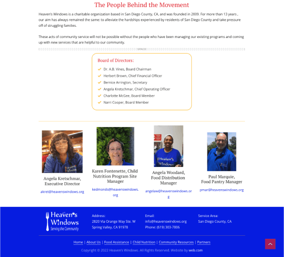
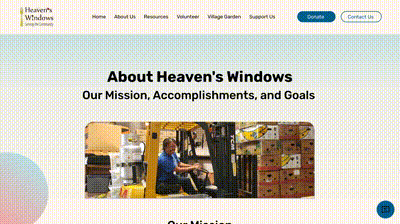
The current website lacks appeal and user-friendliness, hindering Heaven’s Windows from gaining exposure and effectively communicating its mission. Users seeking the organization's resources may find it difficult to navigate and access the necessary information.
The current website lacks appeal and user-friendliness, hindering Heaven’s Windows from gaining exposure and effectively communicating its mission. Users seeking the organization's resources may find it difficult to navigate and access the necessary information.
The current website lacks appeal and user-friendliness, hindering Heaven’s Windows from gaining exposure and effectively communicating its mission. Users seeking the organization's resources may find it difficult to navigate and access the necessary information.
The current website lacks appeal and user-friendliness, hindering Heaven’s Windows from gaining exposure and effectively communicating its mission. Users seeking the organization's resources may find it difficult to navigate and access the necessary information.
02
Lack of diverse stakeholder engagement
The current website fails to cater to the diverse audience of volunteers, staff, partners, and donors within the community. It lacks personalized content and features that would engage each group effectively, potentially leading to a loss of interest and support from these vital users.
The current website fails to cater to the diverse audience of volunteers, staff, partners, and donors within the community. It lacks personalized content and features that would engage each group effectively, potentially leading to a loss of interest and support from these vital users.
The current website fails to cater to the diverse audience of volunteers, staff, partners, and donors within the community. It lacks personalized content and features that would engage each group effectively, potentially leading to a loss of interest and support from these vital users.
The current website fails to cater to the diverse audience of volunteers, staff, partners, and donors within the community. It lacks personalized content and features that would engage each group effectively, potentially leading to a loss of interest and support from these vital users.
Secondary RESEARCH
Exploring nonprofit websites to build a better experience
To understand the effectiveness of other nonprofit websites, we conducted a competitive analysis of existing websites, both in San Diego and internationally.
To understand the effectiveness of other nonprofit websites, we conducted a competitive analysis of existing websites, both in San Diego and internationally.
To understand the effectiveness of other nonprofit websites, we conducted a competitive analysis of existing websites, both in San Diego and internationally.
To understand the effectiveness of other nonprofit websites, we conducted a competitive analysis of existing websites, both in San Diego and internationally.
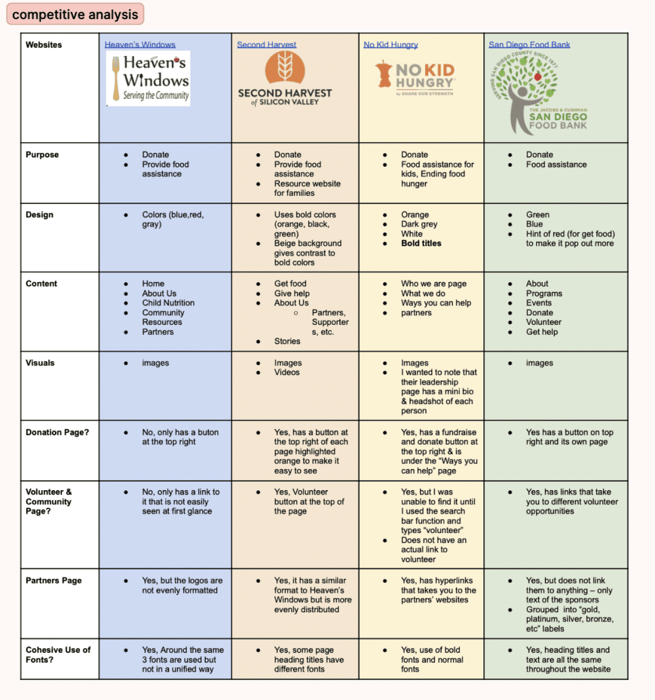

After taking notes of their social media presence, their calls to actions, pages, main visual components, and branding, we identified key strengths, weaknesses, and components we should include in our website:
After taking notes of their social media presence, their calls to actions, pages, main visual components, and branding, we identified key strengths, weaknesses, and components we should include in our website:
After taking notes of their social media presence, their calls to actions, pages, main visual components, and branding, we identified key strengths, weaknesses, and components we should include in our website:
After taking notes of their social media presence, their calls to actions, pages, main visual components, and branding, we identified key strengths, weaknesses, and components we should include in our website:
🙆♂️
Designated volunteering and donation pages for discoverability
Designated volunteering and donation pages for discoverability
Designated volunteering and donation pages for discoverability
Designated volunteering and donation pages for discoverability
🙆♂️
Volunteer stories to connect with potential volunteers
Volunteer stories to connect with potential volunteers
Volunteer stories to connect with potential volunteers
Volunteer stories to connect with potential volunteers
🙆♂️
Statistics to show credible impact on the community
Statistics to show credible impact on the community
Statistics to show credible impact on the community
Statistics to show credible impact on the community
🙅♀️
Excess of information
Excess of information
Excess of information
Excess of information
🙅♀️
Incohesive font style
Incohesive font style
Incohesive font style
Incohesive font style
🙅♀️
No hyperlinking to external resources such as other nonprofits
No hyperlinking to external resources such as other nonprofits
No hyperlinking to external resources such as other nonprofits
No hyperlinking to external resources such as other nonprofits
PRIMARY RESEARCH
We reached out to 36 users for their impressions
We also conducted a survey to understand users’ main needs and obstacles on the website, tailoring questions for different user groups like volunteers, donors, community members, and new users. Volunteers were asked about their experience with volunteer-specific features, like sign-up links and FAQs. The survey revealed users struggled to find information, including links to food assistance and volunteer sign-ups.
We also conducted a survey to understand users’ main needs and obstacles on the website, tailoring questions for different user groups like volunteers, donors, community members, and new users. Volunteers were asked about their experience with volunteer-specific features, like sign-up links and FAQs. The survey revealed users struggled to find information, including links to food assistance and volunteer sign-ups.
We also conducted a survey to understand users’ main needs and obstacles on the website, tailoring questions for different user groups like volunteers, donors, community members, and new users. Volunteers were asked about their experience with volunteer-specific features, like sign-up links and FAQs. The survey revealed users struggled to find information, including links to food assistance and volunteer sign-ups.
We also conducted a survey to understand users’ main needs and obstacles on the website, tailoring questions for different user groups like volunteers, donors, community members, and new users. Volunteers were asked about their experience with volunteer-specific features, like sign-up links and FAQs. The survey revealed users struggled to find information, including links to food assistance and volunteer sign-ups.
We also interviewed 3 Heaven’s Windows volunteers about their stories, which were invaluable for showcasing the impact of volunteering. We asked about their involvement, favorite aspects, and opinions on Heaven’s Windows programs to create relatable content. Additionally, we discussed website layout and color scheme to enhance user engagement.
We also interviewed 3 Heaven’s Windows volunteers about their stories, which were invaluable for showcasing the impact of volunteering. We asked about their involvement, favorite aspects, and opinions on Heaven’s Windows programs to create relatable content. Additionally, we discussed website layout and color scheme to enhance user engagement.
We also interviewed 3 Heaven’s Windows volunteers about their stories, which were invaluable for showcasing the impact of volunteering. We asked about their involvement, favorite aspects, and opinions on Heaven’s Windows programs to create relatable content. Additionally, we discussed website layout and color scheme to enhance user engagement.
We also interviewed 3 Heaven’s Windows volunteers about their stories, which were invaluable for showcasing the impact of volunteering. We asked about their involvement, favorite aspects, and opinions on Heaven’s Windows programs to create relatable content. Additionally, we discussed website layout and color scheme to enhance user engagement.
Insights
☀️
Changing the color scheme and overall styling
Changing the color scheme and overall styling
Changing the color scheme and overall styling
Changing the color scheme and overall styling
Our stakeholder wanted to create a warm and inviting aesthetic and encourage people to stay. We worked on creating a completely different styling to match that vision. We changed the original main colors (highly saturated red and blue) to more soft colors, including yellow, green, pink, and blue.
Our stakeholder wanted to create a warm and inviting aesthetic and encourage people to stay. We worked on creating a completely different styling to match that vision. We changed the original main colors (highly saturated red and blue) to more soft colors, including yellow, green, pink, and blue.
Our stakeholder wanted to create a warm and inviting aesthetic and encourage people to stay. We worked on creating a completely different styling to match that vision. We changed the original main colors (highly saturated red and blue) to more soft colors, including yellow, green, pink, and blue.
Our stakeholder wanted to create a warm and inviting aesthetic and encourage people to stay. We worked on creating a completely different styling to match that vision. We changed the original main colors (highly saturated red and blue) to more soft colors, including yellow, green, pink, and blue.
🔍
Increasing the discoverability of information
Increasing the discoverability of information
Increasing the discoverability of information
Increasing the discoverability of information
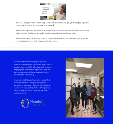
Since the original website lacked coherence and neglected certain user segments, we created dedicated pages for volunteers, staff, donors, community members. We reorganized the flow to be more intuitive and added more call to action buttons that connect every other section and allow easy exploration of programs and resources, especially for first-time users.
Since the original website lacked coherence and neglected certain user segments, we created dedicated pages for volunteers, staff, donors, community members. We reorganized the flow to be more intuitive and added more call to action buttons that connect every other section and allow easy exploration of programs and resources, especially for first-time users.
Since the original website lacked coherence and neglected certain user segments, we created dedicated pages for volunteers, staff, donors, community members. We reorganized the flow to be more intuitive and added more call to action buttons that connect every other section and allow easy exploration of programs and resources, especially for first-time users.
Since the original website lacked coherence and neglected certain user segments, we created dedicated pages for volunteers, staff, donors, community members. We reorganized the flow to be more intuitive and added more call to action buttons that connect every other section and allow easy exploration of programs and resources, especially for first-time users.
📈
Integrating statistics, photos, and texts
Integrating statistics, photos, and texts
Integrating statistics, photos, and texts
Integrating statistics, photos, and texts
To show Heaven’s Windows’ impact more intuitively and leave a deeper impression on the viewers, we included numbers of families and meals they have helped or served on the website. Some photos on the old website were so large that they took up the whole screen. Therefore, we also adjusted the layout to show photos with more effective subtitles on their sides.
To show Heaven’s Windows’ impact more intuitively and leave a deeper impression on the viewers, we included numbers of families and meals they have helped or served on the website. Some photos on the old website were so large that they took up the whole screen. Therefore, we also adjusted the layout to show photos with more effective subtitles on their sides.
To show Heaven’s Windows’ impact more intuitively and leave a deeper impression on the viewers, we included numbers of families and meals they have helped or served on the website. Some photos on the old website were so large that they took up the whole screen. Therefore, we also adjusted the layout to show photos with more effective subtitles on their sides.
To show Heaven’s Windows’ impact more intuitively and leave a deeper impression on the viewers, we included numbers of families and meals they have helped or served on the website. Some photos on the old website were so large that they took up the whole screen. Therefore, we also adjusted the layout to show photos with more effective subtitles on their sides.
USER PERSONA
Empathizing with both types of users
From user research insights, we identified two key stakeholder groups for the website: donors and volunteers.
Our donor persona is frustrated by the lack of transparency and recognition in the donation process
Potential volunteers want to learn more about how they can fulfill their service requirements and the available volunteering times

Donor User Persona

Volunteer User Persona
OPPORTUNITIES
So then, how might we...
redesign the Heaven's Windows website to clearly communicate its impact and inspire greater community engagement through donations and volunteer opportunities?
Information architecture
Crafting an intuitive and accessible site structure
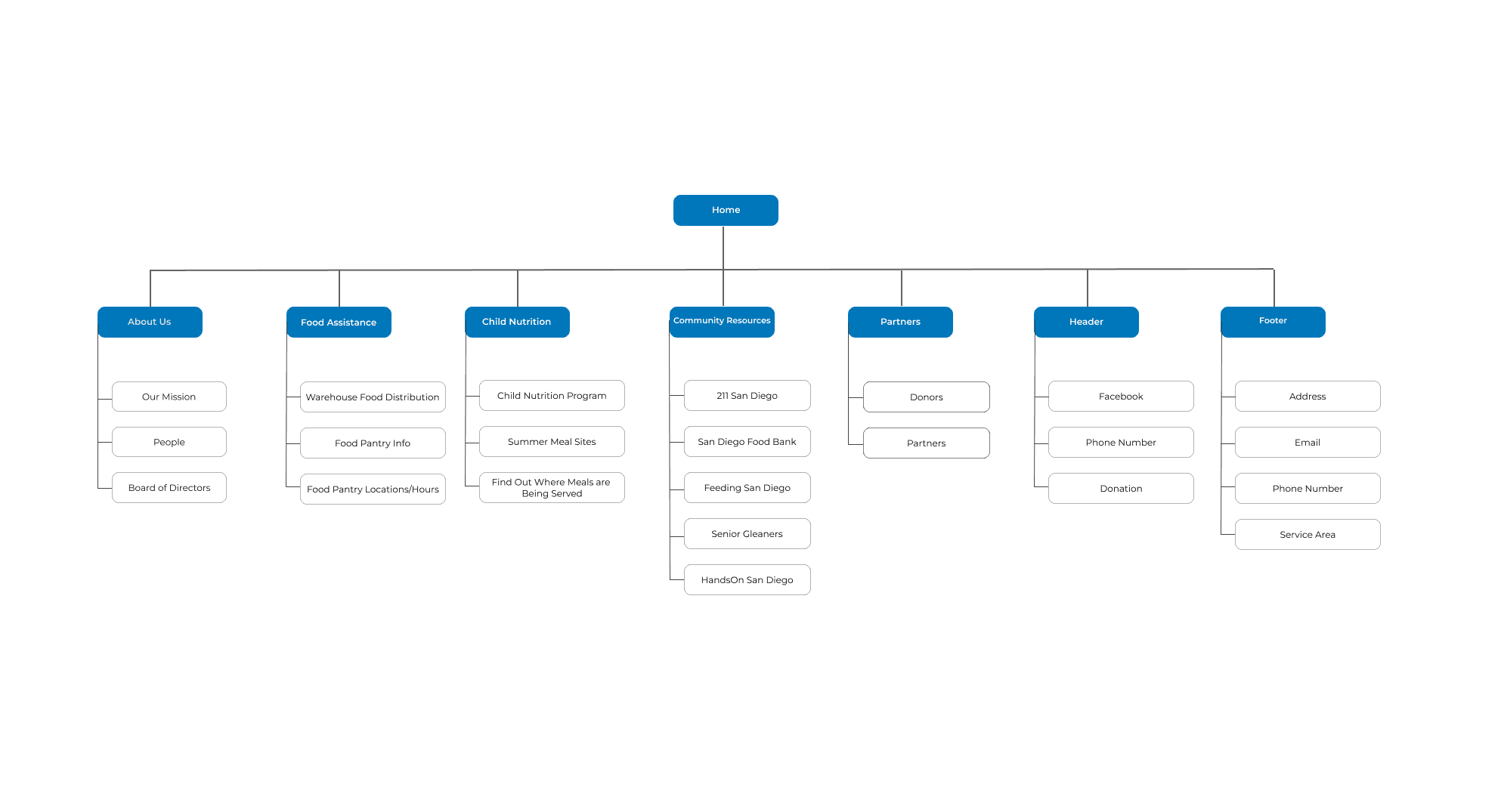
After user research, we created a site map collaboratively with our team, stakeholders, and mentors. We began by analyzing the old Heaven’s Windows website’s structure and identifying essential content. We each proposed a sitemap draft, discussed, and finalized the main sections, hierarchy, and navigation. Feedback from stakeholders and mentor also helped us refine the sitemap.
After user research, we created a site map collaboratively with our team, stakeholders, and mentors. We began by analyzing the old Heaven’s Windows website’s structure and identifying essential content. We each proposed a sitemap draft, discussed, and finalized the main sections, hierarchy, and navigation. Feedback from stakeholders and mentor also helped us refine the sitemap.
After user research, we created a site map collaboratively with our team, stakeholders, and mentors. We began by analyzing the old Heaven’s Windows website’s structure and identifying essential content. We each proposed a sitemap draft, discussed, and finalized the main sections, hierarchy, and navigation. Feedback from stakeholders and mentor also helped us refine the sitemap.
After user research, we created a site map collaboratively with our team, stakeholders, and mentors. We began by analyzing the old Heaven’s Windows website’s structure and identifying essential content. We each proposed a sitemap draft, discussed, and finalized the main sections, hierarchy, and navigation. Feedback from stakeholders and mentor also helped us refine the sitemap.
Old Site Map

New Site Map
style guide
Establishing a welcoming, vibrant brand identity
We curated a mood board with visually appealing elements that resonated with our stakeholders’ vision for a welcoming, bright, and colorful website. We also experimented with colors and fonts that conveyed the desired aesthetic, ensuring they were both visually appealing and ADA compliant.
We curated a mood board with visually appealing elements that resonated with our stakeholders’ vision for a welcoming, bright, and colorful website. We also experimented with colors and fonts that conveyed the desired aesthetic, ensuring they were both visually appealing and ADA compliant.
We curated a mood board with visually appealing elements that resonated with our stakeholders’ vision for a welcoming, bright, and colorful website. We also experimented with colors and fonts that conveyed the desired aesthetic, ensuring they were both visually appealing and ADA compliant.
We curated a mood board with visually appealing elements that resonated with our stakeholders’ vision for a welcoming, bright, and colorful website. We also experimented with colors and fonts that conveyed the desired aesthetic, ensuring they were both visually appealing and ADA compliant.

Moodboard
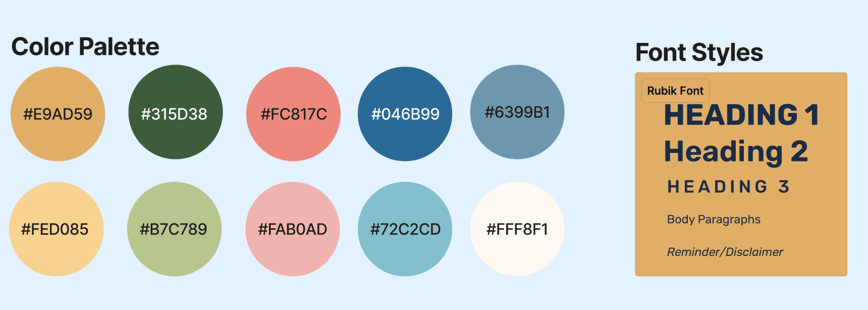
Finalized Style Guide
low fidelity wire-framing
Building the foundation with clear, concise layouts
Based on the finalized sitemap, our team individually created low fidelity wireframes on a shared Figma file. We discussed and integrated preferred layouts and elements into a unified wireframe, aimed to maintain clarity and conciseness while presenting comprehensive information.
Based on the finalized sitemap, our team individually created low fidelity wireframes on a shared Figma file. We discussed and integrated preferred layouts and elements into a unified wireframe, aimed to maintain clarity and conciseness while presenting comprehensive information.
Based on the finalized sitemap, our team individually created low fidelity wireframes on a shared Figma file. We discussed and integrated preferred layouts and elements into a unified wireframe, aimed to maintain clarity and conciseness while presenting comprehensive information.
Based on the finalized sitemap, our team individually created low fidelity wireframes on a shared Figma file. We discussed and integrated preferred layouts and elements into a unified wireframe, aimed to maintain clarity and conciseness while presenting comprehensive information.

Mid fidelity wire-framing
Enhancing navigation and user flow for seamless connectivity
Moving forward, we focused on mapping out interactions between pages. To facilitate connectivity and accessibility throughout the website, we incorporated links to other pages on each screen. For instance, on the donate page, we included an “Other Ways to Help” section with links to the volunteer page and the Village Garden Project page, ensuring easy navigation for users.
Moving forward, we focused on mapping out interactions between pages. To facilitate connectivity and accessibility throughout the website, we incorporated links to other pages on each screen. For instance, on the donate page, we included an “Other Ways to Help” section with links to the volunteer page and the Village Garden Project page, ensuring easy navigation for users.
Moving forward, we focused on mapping out interactions between pages. To facilitate connectivity and accessibility throughout the website, we incorporated links to other pages on each screen. For instance, on the donate page, we included an “Other Ways to Help” section with links to the volunteer page and the Village Garden Project page, ensuring easy navigation for users.
Moving forward, we focused on mapping out interactions between pages. To facilitate connectivity and accessibility throughout the website, we incorporated links to other pages on each screen. For instance, on the donate page, we included an “Other Ways to Help” section with links to the volunteer page and the Village Garden Project page, ensuring easy navigation for users.

Usability testing
Incorporating user feedback into final designs
We tested our mid-fi prototype with various types of users by asking them to perform a series of simple tasks, such as finding the link to donate, finding the link to volunteer, finding a summer meal site, and more. From our user testing, we gained a significant amount of insights and made changes accordingly:
We tested our mid-fi prototype with various types of users by asking them to perform a series of simple tasks, such as finding the link to donate, finding the link to volunteer, finding a summer meal site, and more. From our user testing, we gained a significant amount of insights and made changes accordingly:
We tested our mid-fi prototype with various types of users by asking them to perform a series of simple tasks, such as finding the link to donate, finding the link to volunteer, finding a summer meal site, and more. From our user testing, we gained a significant amount of insights and made changes accordingly:
We tested our mid-fi prototype with various types of users by asking them to perform a series of simple tasks, such as finding the link to donate, finding the link to volunteer, finding a summer meal site, and more. From our user testing, we gained a significant amount of insights and made changes accordingly:
Who we tested on
Heaven’s Windows Team 👩💼
Our Mentors 👩🏫
Everyday People 👥
Heaven’s Windows Team 👩💼
Our Mentors 👩🏫
Everyday People 👥
Heaven’s Windows
Team 👩💼
Our Mentors 👩🏫
Everyday People 👥
Heaven’s Windows Team 👩💼
Our Mentors 👩🏫
Everyday People 👥
What we learned
Changing our “Get Help” section to “Resources”
Removing the 3rd button in the navigation bar
Adding a button for our home page
Changing our “Get Help” section to “Resources”
Removing the 3rd button in the navigation bar
Adding a button for our home page
Changing our “Get Help” section to “Resources”
Removing the 3rd button in the navigation bar
Adding a button for our home page
Changing our “Get Help” section to “Resources”
Removing the 3rd button in the navigation bar
Adding a button for our home page
FINAL DELIVERABLE
Solution Highlights
Based on user testing feedback, we focused on visual elements and branding in our high-fidelity designs, incorporating colors and elements like gradient circles in the backgrounds to create a bright, colorful, and welcoming atmosphere. These high-fidelity screens served as the blueprint for the implementation phase with our web developer.
Based on user testing feedback, we focused on visual elements and branding in our high-fidelity designs, incorporating colors and elements like gradient circles in the backgrounds to create a bright, colorful, and welcoming atmosphere. These high-fidelity screens served as the blueprint for the implementation phase with our web developer.
Based on user testing feedback, we focused on visual elements and branding in our high-fidelity designs, incorporating colors and elements like gradient circles in the backgrounds to create a bright, colorful, and welcoming atmosphere. These high-fidelity screens served as the blueprint for the implementation phase with our web developer.
Based on user testing feedback, we focused on visual elements and branding in our high-fidelity designs, incorporating colors and elements like gradient circles in the backgrounds to create a bright, colorful, and welcoming atmosphere. These high-fidelity screens served as the blueprint for the implementation phase with our web developer.
First Sight Delight — Homepage Warmth that Invites
First Sight Delight —
Homepage Warmth that Invites
First Sight Delight — Homepage Warmth that Invites
First Sight Delight — Homepage Warmth that Invites
Before

The color scheme lacked warmth and invitation, and there was a notable absence of statistics or calls to action.
After
We followed the new style guide to convey a bright and welcoming atmosphere alongside the numbers to visualize accomplishments and shortcuts to resources.
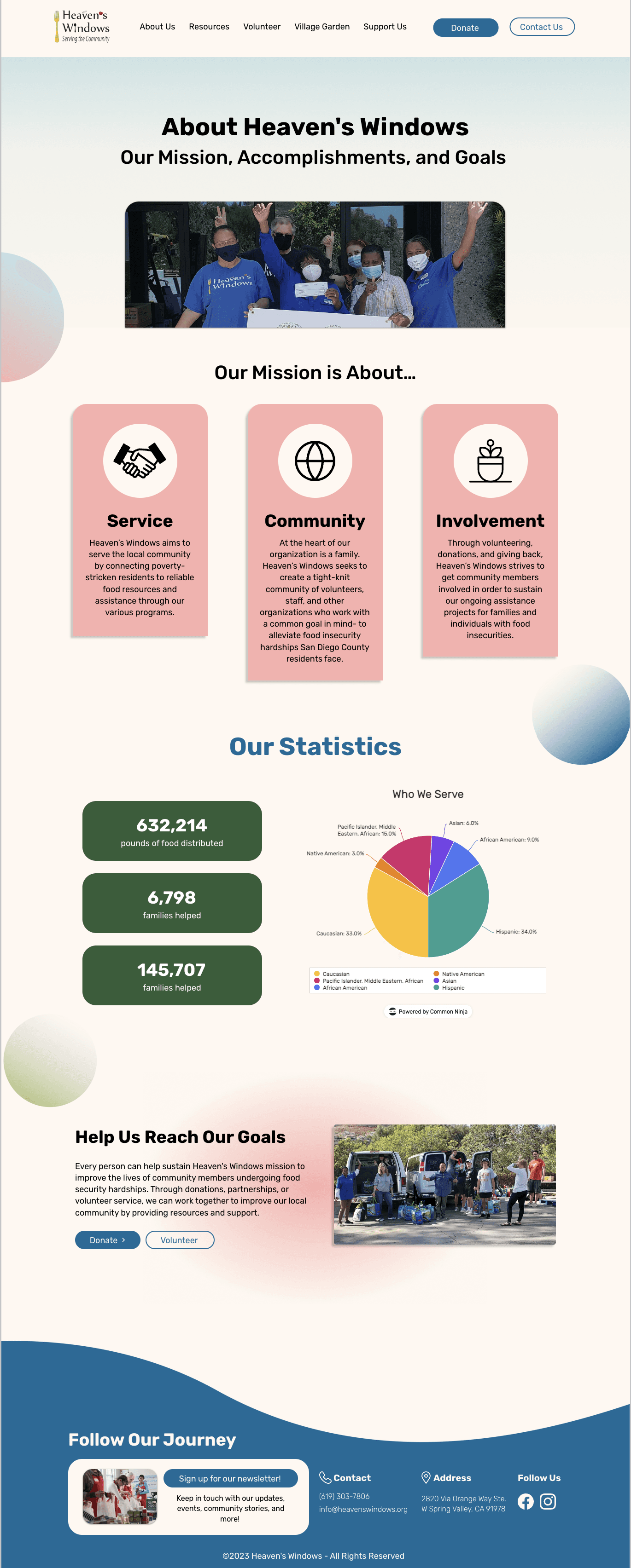
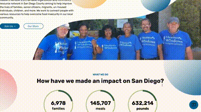
Illuminate the Impact — Clear, Compelling Visualization
Illuminate the Impact — Clear, Compelling Communication
Illuminate the Impact — Clear, Compelling Communication
Illuminate the Impact — Clear, Compelling Communication
Before
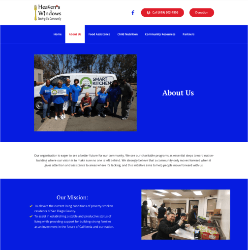
With a plain layout, the original “About Us” page failed to make a lasting, impactful impression on users. The impact lacked supporting data.
After
We clearly concluded Heaven’s Windows’ mission with explanations and presented more tangible impact through graphs and statistics.
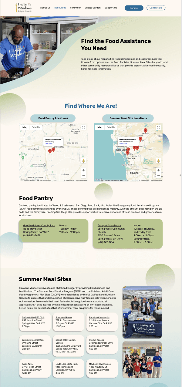
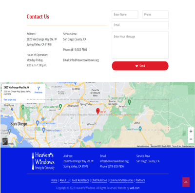
Resources Made Accessible — Find What You Need with Ease
Resources Made Accessible — Find What You Need with Ease
Resources Made Accessible — Find What You Need with Ease
Resources Made Accessible — Find What You Need with Ease
Before
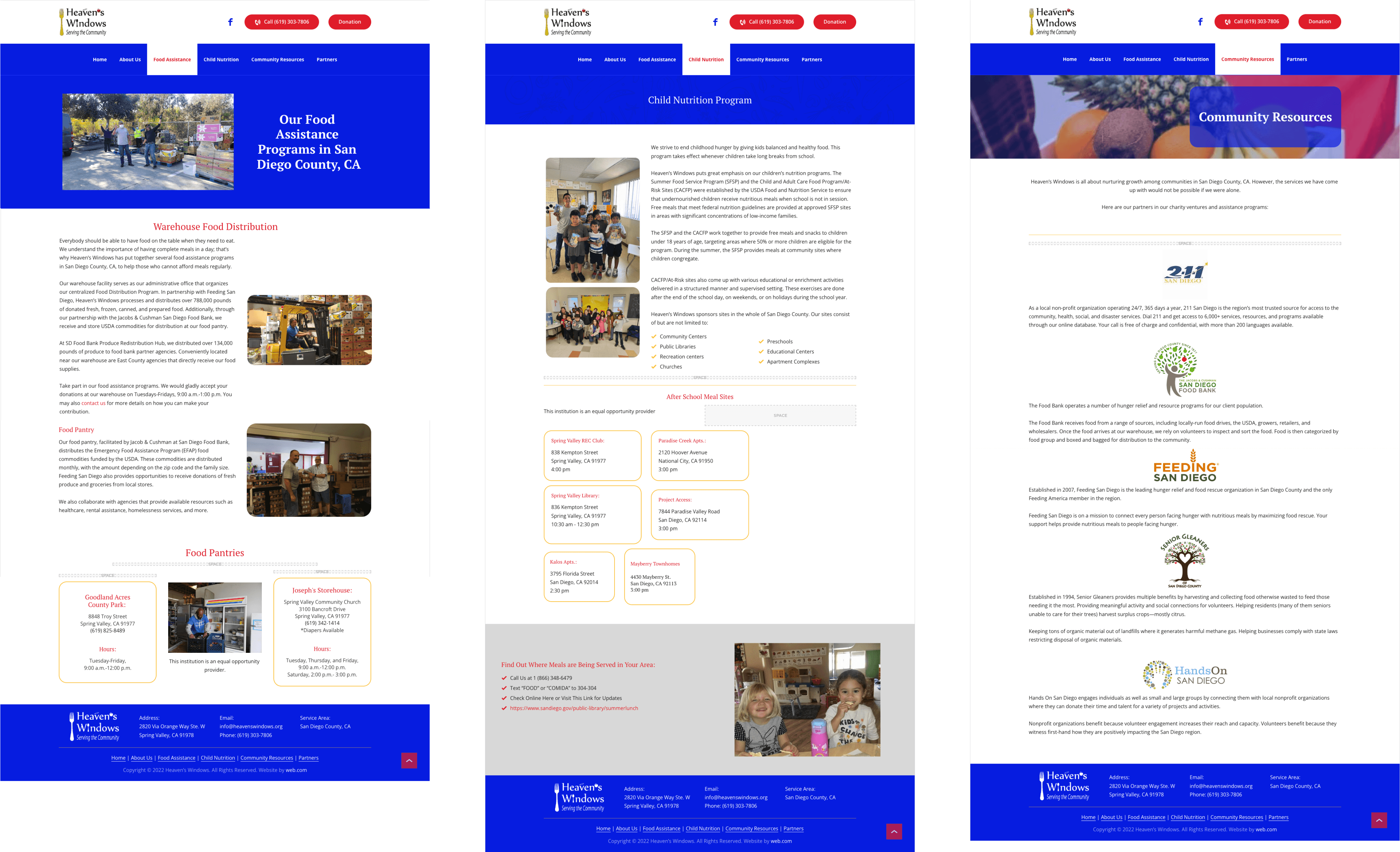
Three different pages made it difficult and time-consuming for users to find food assistance, child nutrition, and community resources.
After

We combined all resources into one page for easier navigation. We also added interactive maps that allow faster access to nearby food resources.
REFLECTION
⏰
⏰
⏰
⏰
Ensure timely communication to deliver a satisfying design
Ensure timely communication to deliver a satisfying design
Ensure timely communication to deliver a satisfying design
Ensure timely communication to deliver a satisfying design
For high fidelity wire-framing, our team wanted to include exciting sections, such as community stories, to further engage users and demonstrate Heaven’s Windows impact. However, due to time constraints, our client couldn’t provide the necessary information on time. This taught us the importance of requesting content early and following up consistently to avoid last-minute delays.
For high fidelity wire-framing, our team wanted to include exciting sections, such as community stories, to further engage users and demonstrate Heaven’s Windows impact. However, due to time constraints, our client couldn’t provide the necessary information on time. This taught us the importance of requesting content early and following up consistently to avoid last-minute delays.
For high fidelity wire-framing, our team wanted to include exciting sections, such as community stories, to further engage users and demonstrate Heaven’s Windows impact. However, due to time constraints, our client couldn’t provide the necessary information on time. This taught us the importance of requesting content early and following up consistently to avoid last-minute delays.
For high fidelity wire-framing, our team wanted to include exciting sections, such as community stories, to further engage users and demonstrate Heaven’s Windows impact. However, due to time constraints, our client couldn’t provide the necessary information on time. This taught us the importance of requesting content early and following up consistently to avoid last-minute delays.
Find ways to work with designers across time zones
Find ways to work with designers across time zones
Find ways to work with designers across time zones
Find ways to work with designers across time zones
During this project, I was based in China while the rest of the team was in the U.S. Initially, the 15-hour time difference posed challenges for collaboration, but we managed to schedule meetings accommodating both time zones. When unable to attend, I communicated updates via Slack, reviewed meeting notes, and worked independently. I’m grateful for the teamwork and support from all members.
During this project, I was based in China while the rest of the team was in the U.S. Initially, the 15-hour time difference posed challenges for collaboration, but we managed to schedule meetings accommodating both time zones. When unable to attend, I communicated updates via Slack, reviewed meeting notes, and worked independently. I’m grateful for the teamwork and support from all members.
During this project, I was based in China while the rest of the team was in the U.S. Initially, the 15-hour time difference posed challenges for collaboration, but we managed to schedule meetings accommodating both time zones. When unable to attend, I communicated updates via Slack, reviewed meeting notes, and worked independently. I’m grateful for the teamwork and support from all members.
During this project, I was based in China while the rest of the team was in the U.S. Initially, the 15-hour time difference posed challenges for collaboration, but we managed to schedule meetings accommodating both time zones. When unable to attend, I communicated updates via Slack, reviewed meeting notes, and worked independently. I’m grateful for the teamwork and support from all members.
Thanks for reading!
Thanks for reading!
Thanks for reading!
Thanks for reading!
You may also like
You may also like
You may also like
You may also like

SNAPCHAT
Enhanced instant socializing by introducing event creation and joining features
Enhanced instant socializing by introducing event creation and joining features
Feature Design
User Research
Testing & Iteration

MOBILHUB
Fostered community ownership and accessible navigation through a mobile app
Fostered community ownership and accessible navigation through a mobile app
3rd Place
Design-a-thon
Rapid Prototyping
Heaven’s Windows
Heaven’s Windows
Heaven’s Windows
Revamping the website to enhance the nonprofit’s reach, fostering greater donor and volunteer involvement
Type Nonprofit Website Redesign
Timeline July 2023 - Sep 2023
Role UI/UX Designer
Team 6 Designers,
1 Web Developer,
1 Design Mentor
Type Nonprofit Website Redesign
Timeline July 2023 - Sep 2023
Role UI/UX Designer
Team 6 Designers, 1 Web Developer,
1 Design Mentor
Type Nonprofit Website Redesign
Timeline July 2023 - Sep 2023
Role UI/UX Designer
Team 6 Designers, 1 Web Developer,
1 Design Mentor